Element-UI
-
目前星星數最多的vue ui框架,其他也還是有很多選擇,可參考2019 Javascript Rising Stars
載入Element-UI
import ElementUI from 'element-ui'
import 'element-ui/lib/theme-chalk/index.css'
import locale from 'element-ui/lib/locale/lang/zh-TW'

Vue.use(ElementUI, { locale }) // 設定語言為繁中
Layout
- Element-UI提供非常方便的”Layout”功能,以「欄」和「列」來進行排版,欄寬以總數為”24”以比例切割的方式設定。
- 非常近似為Bootstrap的「Grid-System」、或者本教學所使用的Element-UI的「Layout布局」:
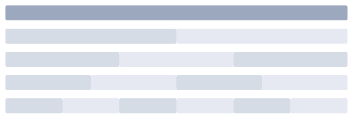
圖片截取至 Element-UI Layout布局 @ element-ui
練習環境準備
-
使用vue-cli建立新的空白專案,並依前述步驟安裝element-ui。
-
src/App.vue加入以下css樣式,並設定<router-view>標籤寬度800px。#app { font-family: 'Avenir', Helvetica, Arial, sans-serif; -webkit-font-smoothing: antialiased; -moz-osx-font-smoothing: grayscale; color: #2c3e50; // 置中 display: flex; flex-direction: column; align-items: center; } -
增加一個新的Component作為練習使用的新頁面,並設定路由指向到Component。
-
在src/中建立一個名稱為
utils的資料夾,將gitlab範例資料夾內所有的檔案複製到utils資料夾中。
表單練習(1)
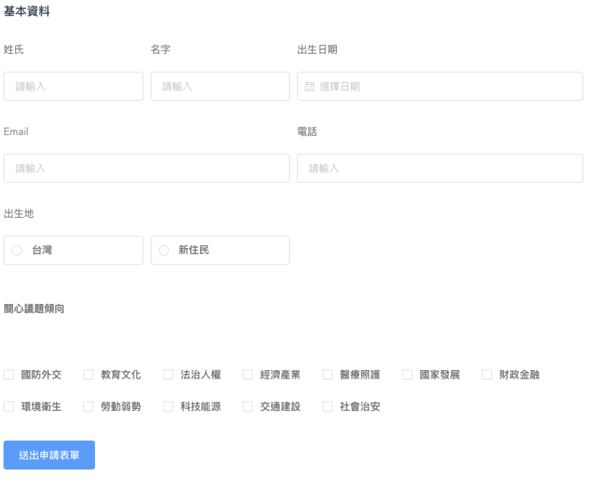
練習用element-ui做出一個基本表單,使用以下json作為記錄資料的物件:
form: {
  surname: '',
  name: '',
  birthday: '',
  lineId: '',
  email: '',
  phone: '',
  birthplace: '',
  birthplaceCity: '',
  immigrationCountry: '',
  issuesPreference: []
}
兩種功能很像的「可搜索式選單」
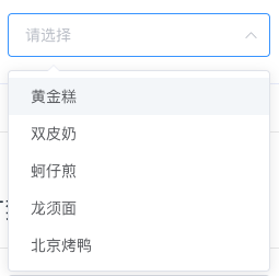
- 可搜索的「下拉選單」
輸入文字僅查詢用,還需點選選項。在Element-UI中為”Select”的功能
Select @ element-ui
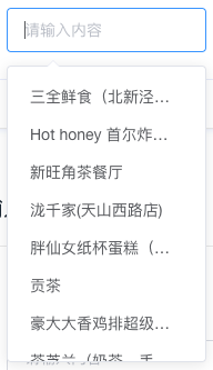
- 有autocomplete功能的「輸入框」
可輸入文字或點選選項,需自行實作篩選功能。在Element-UI中為”Input”的功能
Input @ element-ui
表單練習(2)
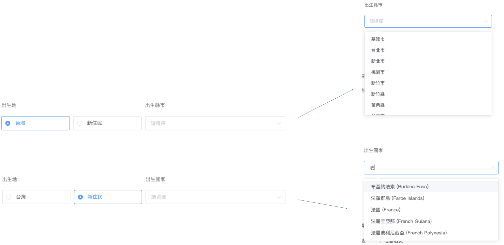
- 「出生地」要有連動表單的功能
- 「出生縣市」為下拉選單
- 「出生國家」為下拉選單並能輸入文字篩選(使用”Select”)
表單練習(3)
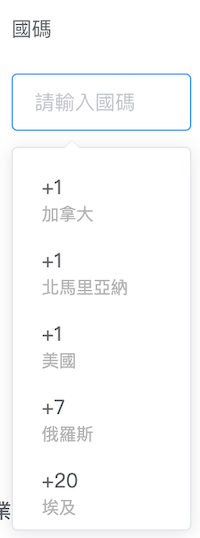
「國碼」選單有autoomplete功能(使用”Input”)
表單驗證
- 表單最外層的
<el-form>要加入model及rules兩個屬性,model為資料來源的物件名稱,rules為設定驗證規則的物件名稱 - 每一個表單元素都要用
<el-form-item>包住,並在<el-form-item>要加入屬性prop,為其綁定資料的欄位名稱
表單驗證文件 @ element-ui
表單驗證– 設定驗證規則
每個欄位可設定單個或多個驗證規則
rules: {
  surname: [
    { required: true, message: '必填', trigger: 'blur' }
  ],
  name: [
    { required: true, message: '必填', trigger: 'blur' }
  ],
  birthday: [
    { required: true, message: '必填', trigger: 'change' }
  ],
  email: [
    { required: true, message: '必填', trigger: 'blur' },
    { type: 'email', message: 'EMail格式不正確', trigger: 'blur' }
  ],
  phone_number_code: [
    { required: true, message: '必填', trigger: 'change' }
  ],
  phone: [
    { required: true, message: '必填', trigger: 'blur' }
  ],
  birthplace: [
    { required: true, message: '必填', trigger: 'change' }
  ],
  issuesPreference: [
    { required: true, message: '必填', trigger: 'change' },
    { validator: veridateArrayRequired, trigger: 'change' }
  ],
}
自定義validate
- 在
rules中所對應的資料欄位加入參數validate,可自定驗證規則 - 直接呼叫第三個參數callback函式為驗證成功
- 呼叫第三個參數callback函式、並傳入Error物件為驗證失敗
範例1:驗證密碼強度
const validatePasswordStrength = (rule, value, callback) => {
  if (value.length < 8) {
    callback(new Error('密碼必須8碼以上'))
  } else if (value.match(/([a-z]+/) == null || value.match(/[0-9])+/) == null) {
    callback(new Error('密碼必須包含英文及數字'))
  } else {
    callback()
  }
}
範例2:驗證確認密碼是否一致
const validatePasswordCheckedStrength = (rule, value, callback) => {
  if (this.form.password !== this.form.checkPassword) {
    callback(new Error('密碼不一致'))
  } else {
    callback()
  }
}表單練習(4)
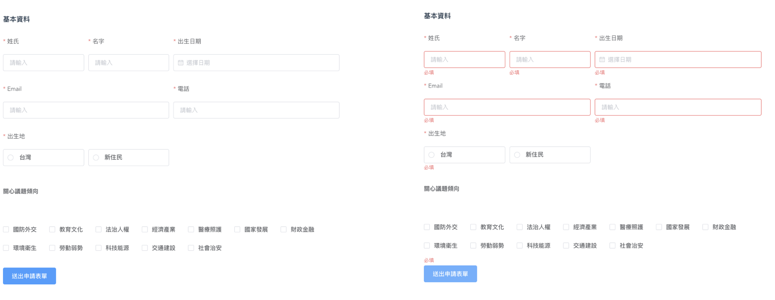
- 必填欄位游標移開要進行驗證
- 點選「送出」按鈕時全部欄位進行驗證
表單練習(5)
- Email欄位要驗證email格式(element-ui有內建email type)
- 關心議題傾向至少要選擇三個選項
表單練習(6)
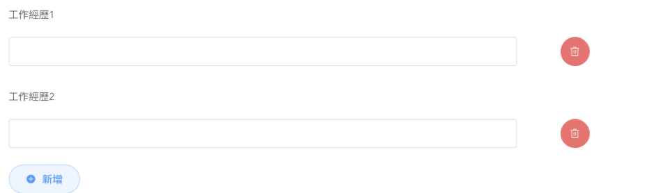
- 增加一個動態欄位,要能夠增加及刪除
可參考動態表單範例 @ element-ui
-
有兩筆以上資料時才出現刪除按鈕
-
增加「清空」按鈕,點下要能清空表單資料。
表單練習(7)
- 增加一個
prop參數,如有傳入則取代原本的表單資料物件,如無值則使用原本的預設值。
提示:
(1) 建議在watch內使用「深拷貝」的取得prop參數(使用深拷貝是為避免資料渲染)
(2) 前述取得prop參數也可寫在created內,但需注意Component建立的時間點是否已取得資料
- 增加一個
prop參數,命名為state。當state等於”add”時原本的送出表單按鈕文字為「送出申請表單」,當state等於”edit”時按鈕文字為「編輯申請表單」
表單練習(8)
-
建立一個Component,作為「新增表單」的頁面,將前面練習的表單Component引入,props
state設定為”add” -
建立一個Component,作為「編輯表單」的頁面,將前面練習的表單Component引入,props
state設定為”edit”,propsdefaultForm屬性設定表單初始值(模擬跟後端取得的編輯表單資料)